Subscribe Via Email

Like reading this blog? You can get the complete text of the latest articles at Within My Means in your email inbox each morning by entering your email address below, then verifying the subscription. Your address will only be used for mailing you the blog, and each one will include a link so you can unsubscribe at any time.

Enter your email address:

Delivered by FeedBurner

July 16, 2019

Watercolors Week Four - Shadows

my painting
This week's watercolor lesson was about painting shadows.  I arrived after the lecture, so just took a stab at it, with occasional comments from the instructor.  My sample painting also had a lot of white in it, which I really haven't learned to approach as of yet.  I did have fun mixing paint pigments though, and each lesson teaches you something.  I am stretching way out of my comfort zone this summer, and I'm proud of myself for that.

The sample painting I was assigned to copy

Our instructor gave us a handout with paint "recipes" she uses to create shadows, and emphasized that while they are darker shades, shadows reflect the color of the object they are projecting.

the full image that I was copying, though I cropped my drawing

July 8, 2019

Watercolors Week Three — Gimmicks

the professor's demonstration in class
In today's watercolor class, we learned to use candle wax, saran wrap, and salt (table salt, rock salt, or margarita salt) to create textured effects in our watercolors.  The professor called today's lesson "Gimmicks."  I had such fun trying them all out.


In class I came up with a quick little picture to illustrate all three techniques.  This is a project I could use with 4-H kids, and I bet they'd enjoy playing with the different mediums.  It also demonstrates shading, as I mixed three different green colors for the tree itself.  

The first of the instructor's techniques that she demonstrated was using plain wax from a normal tapered candle.  Using the candle as a pencil before applying any paint creates a resist, where the waxed areas will not accept the paint.  The instructor demonstrated this by using wax to portray snow on her mountaintops.  In my little holiday tree painting, I used wax to highlight an area of the star where I wanted some shine.

In the second technique demonstrated, paint is first applied.  While the paint is wet, a piece of saran wrap is "stretched" so that it gets small lateral folds in the plastic wrap.  this is laid on top of the area, and smoothed out by hand.  I should have taken a photo of the plastic wrap while it was lying on my painting.  Once dry, or at least mostly dry, the plastic wrap is lifted off of the painting, leaving texture to the paint.  The instructor demonstrated this technique as a way to add life to water, whether horizontal, or vertical as in a waterfall.  In my painting I used it to give texture to my tree boughs.  The photo doesn't show it well but there is actually texture to all three shades of green.  

Lastly, the instructor had salt in three different gradients for us to play with as a way to add texture.  Table salt, Margarita salt, and Rock salt were shaken lightly across wet paint.  Instantly, the salt would soak up the pigment.  After the painting has dried, the salt can be wiped away.  If left on a finished work displayed over time, the sodium could eat into a canvas.  In a casual painting such as my holiday one, I found no need to wipe it away.  I liked the rough texture left on the tree trunk in my painting.

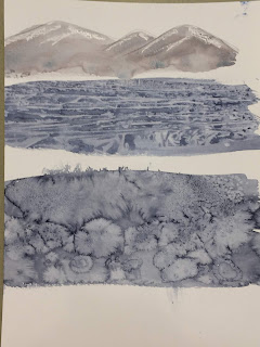
the sample painting from the instructor that was my assignment to copy.
I was supposed to spend the class time painting one of the instructor's samples that could be used to demonstrate the techniques she had shown us.  But after doing my simple original drawing, I didn't have a lot of time to do a full-blown assignment.  

I spent 30 minutes or so doing a quick impression of the painting above, and used some salt to make the colors bleed a little.  Next week, I'll play along a bit better with the assignment.

July 5, 2019

Acrylics Week Two - Painting!


I started a masterpiece today in my Acrylics painting class that I'm taking this summer through Burbank Parks and Rec.  This was my second class session, though technically it's the fourth, since I missed the first and third sessions due to work.  

I did some homework since the last class and sketched my photograph of my beloved pup Caitie.  I'd also bought a desk easel.  I found it easier to paint with the canvas flat on the table, but it was helpful to have the photo I was painting upright in front of me. 

I could have started painting at home, but I wanted the input and guidance of our instructor.  He suggested starting the painting with the eyes and nose, as the major body parts would give some form to what I was doing.  I took his advice, but also wanted to paint the backdrop, so that when I did the dog's fur, I wouldn't lose the fuzziness of the edges by having to paint the backdrop afterward.  The opportunity to break in a full new set of paints was luscious.  It was fun to mix my own color shades beyond the twenty four colors the kit provided.  

To look at the painting, I feel like I've only put in two percent of what will be needed to finish it.  But at least I've begun.  I'm excited to see all these progress photos next to each other when I'm finally done. 

July 4, 2019

Watercolors Week Two - Color Palettes


In this week's watercolor class, our instructor  Ms. McDonald gave a lesson on color palettes and the use of expressive color and shading.  She explained that she'd taken lessons from the local painter Joseph Stoddard, and used his examples to explain vivid use of color to us.  In her lecture, she quickly painted the tree above as an example, mixing several shades of greens intuitively, then showing how Stoddard would use a dark color to illustrate branches against a light background, and switch to a light branch by removing or scraping the paint when it's against a dark background. 


Above and below are a couple of books by Joseph Stoddard.  I took pictures so I can look them up on paperback swap or Amazon to get my own copies. 


Stoddard's paint palette is mixed from the colors above.  Below are a couple examples of his work that I loved.  The photo is above his interpretation of the Mission San Luis Obispo.  The last is Phillipe's French Dip restaurant in downtown Los Angeles. 


Our instructor had Prismacolor Col-Erase 20048 Black pencils at each station that she said were easy to sketch the outline of our drawing because the pencil lines could be easily erased after we were done without damaging the watercolor paints. 

We had three handouts on color combinations:


Just as last week, our instructor had a sampling of photos and clippings we could choose from as an example to paint.  The idea was to change the photo to our own color interpretation.  Above is the one that I chose, before I knew the purpose of the assignment.  I actually chose it because I liked the tones in the photo, and the idea of a yellow house.  After the lecture, we had about an hour, or a little more, to do the assignment in class.

I tried to do clouds as I'd seen the instructor demonstrate, by blotting with a paper towel or tissue paper.  My clouds retained the grid pattern from my paper towel.  I wished I'd had more time to play.  Some students continue working on the assignment at home during the week; I doubt I will make time for that during this course.  Mostly I left with a sense of creative inspiration from this class.  It will take some practice to feel like I've learned technique.

my painting